Background
Overcoming Financial Barriers to Dental Care Access
The high costs associated with dental care often prevent individuals from accessing the treatments recommended by their healthcare providers. Due to these expenses and insurance limitations, only a small fraction of patients complete their recommended treatments. This project aims to alleviate the burden of large medical bills by helping patients navigate financial barriers.
The Problem
Investigate user needs and design solutions for strategic financial planning in the context of dental care.
The Solution
An online mobile web platform that streamlines the entire dental experience, from exam results to treatment, by prioritizing financial planning through:
-
Intuitive Treatment Overview: Provides a clear view of the patient's overall treatment details, including recommended treatments, costs, insurance coverage, and payment options.
-
Human-Centered Patient Journey: Optimized for patients, the platform ensures a seamless flow from viewing recommended treatments and their costs to choosing payment options and scheduling appointments.
Impact
-
Enhanced Financial Clarity: Users reported feeling more informed and in control of their dental care decisions due to the clear presentation of treatment costs, insurance coverage, and payment options.
-
Increased Treatment Completion: By addressing financial barriers upfront, more patients were able to complete their recommended treatments.
-
Improved Patient Satisfaction: The human-centered design of the platform made the dental care journey smoother and less stressful, leading to higher overall patient satisfaction.
-
Accessible Dental Care: The platform's focus on financial planning helped bridge the gap between patients and the dental care they needed, making quality dental care more accessible to a broader audience.
Project Background
Overcoming barriers to dental care access
The high price tags associated with dental care can be a significant barrier that often keeps individuals from accessing recommended treatments suggested by their healthcare providers. Unfortunately, a small chunk of patients are actually able to complete these treatment recommendations, largely due to high expenses and insurance limitations. This project seeks to soften the blow of large medical bills by addressing the ways in which patients navigate these barriers.
Design Process
Challenge
Investigate user needs and design relevant solutions to strategically planning financials in context to dental care
Discover
Research Objectives
1
Is there a need to be met?
-
Understand the process of receiving dental treatment recommendations as a whole and determine where a problem may exist
2
Understand the user perspective
-
How do patients approach financials in dental care
-
How do patients view and prioritize dental care
3
Understand user frustrations and pain points
-
Discover user preferences and goals
-
Learn user pain points and frustrations
Reading between the lines
If I want to provide a solution within the dental system, I need to uncover the problem. To do that, I need to first understand the system.
The patient experience
Not all dental offices are the same, but there is a typical experience a patient can expect
Schedule an appointment
Go to your appointment
Receive an exam
Receive recommendations for treatment
Receive treatment
But something more occurs between those blocks. With treatment recommendations come the price tag of that treatment. Couple that with the complexities of insurance coverage, and things get a little bit more challenging.
Schedule an appointment
Go to your appointment
Receive an exam
Receive recommendations for treatment
Cost of treatment
Insurance coverages
Receive treatment
This is the barrier I am looking to address
Exploring the current competition
I conducted a competitive audit to get a closer look at what current dental practices are doing to bringing patients to the point of recieving treatment.

All providers offered a menu of payment options to address expensive treatments
3rd party financing
Open a line of credit through a third party financer associated with the dental practice
In house payment agreements
Start a payment plan with the dental practice itself
Discount plans
Sign up for a membership that offers discounts off of certain treatments per year
If dental providers are already offering solutions to the price tag, what do patients have to say about it?
Learning from the audience
I recruited 5 participants to discuss views on dental care, cost of treatment, and their overall experiences. Below are a few of the questions asked:
-
What are your thoughts on dental care?
-
How would you describe your experiences with going to the dentist?
-
How and when do you usually seek dental care?
-
What questions or concerns did you have at the moment of receiving your treatment recommendation and cost breakdown?
-
Can you tell me about some barriers that might be keeping you from moving forward with the treatment?
I was led to five key takeaways
There are varying opinions on the value of dental care
Despite participants unanimously agreeing on the importance of dental hygiene, not all agree on the importance of seeing a dentist regularly
Diagnosis and treatment recommendations are often brushed off
Participants all stated they struggled to find value in their diagnosis
Participants want affordable alternatives
They felt that their dental provider only offered them the high end service
Participants have diagnosis and cost expectations before attending any consult appointments
They have stated that depending on the nature of the dental issue, they have a ballpark expectation of what the diagnosis will be and, accordingly, how much they are willing to pay. As a result, when a price that is higher than expected is introduced, participants more or less reject both the diagnosis and treatment.
Transparency is highly valued
Participants feel left in the dark and confused about their options and therefore feel they are being scammed.
Patients want trustworthy care
Knowing that dental providers already offer payment options and patients are still hesitant to complete treatment, I was realized that there was a lack of trust and transparency.
With participants stating that their dental experiences do not usually turn out as they expected and that they feel like there are holes in the overwhelming amount of information given to them, it's clear that current system of delivering such important information isn't quite hitting the mark.
Define
Aligning my findings with the challenge
Getting a better understanding of the audience
I started by defining the audience I would be designing for
Users who are currently receiving dental care and...
-
want access to affordable treatments
-
want to trust their dental care providers and the treatments they recommend
-
want meaningful and thorough information about the treatment recommendations
Empathizing with the user
I created user personas based on the wide range of users who may seek dental care
As a user, Alonna should...
Be able to easily keep track of her dental expenses so that she can worry less about it and focus on her family.

As a user, Jacob should...
Be able to view and plan for all of his many treatment recommendations.

As a user, Ryan should...
Feel assured that his dental care and expenses are organized and easy to understand.

The users' stories
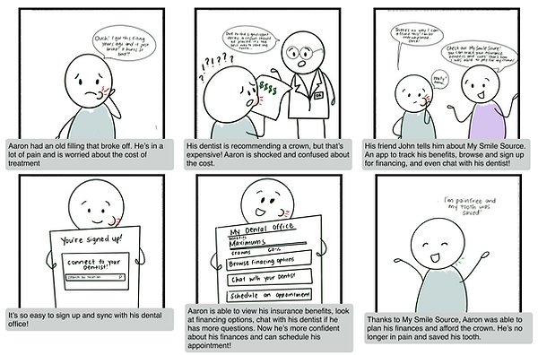
To outline the user journey with the help of the product, I created a storyboard. In this stage, the product name was still being decided, hence why "My Smile Source" is used instead of Flossy.

POVs and HMWs
I moved on to creating Point of View statements and How Might We statements and highlighted the ones that best aligned with the goal
Point of View statements
I'd like to explore how to help people needing dental care budget for appointments because the high prices deter them from going through with the treatment
I’d like to explore how to help people who get dental care track their dental costs because they feel they don’t understand the amount they are expected to pay.
I’d like to explore how to help people needing dental care build a stronger relationship with their providers because they are skeptical about their diagnosis and recommended treatment.
People who want to get dental treatments need an easy way to learn about their insurance benefits because, in the past, they had unexpectedly high dental bills.
How Might We statements
How might we make dental care more affordable?
How might we make planning for dental care costs easy and rewarding?
How might we strengthen the patient-doctor relationship?
How might we encourage people to go through with dental care treatment?
How might we make it easier for people to understand their insurance benefits before seeking dental care?
Actionable insights
At the end of this phase, I found that there is a user need in regards to financial planning for dental care.
People seeking affordable dental treatments could benefit from an all in one resource that outlines their treatment details, insurance coverages, and financial resources
Business should offer more transparency on costs, payment options, and potentially treatment alternatives to increase patient trust and retention.
Develop
Ideating potential solutions
How might we design a platform that fosters trust between patient and provider?
How would the users organize key features?
I conducted a card sorting exercise to learn how users organize and categorize certain topics related to the product. Users were asked to group 35 cards as they see fit and then name each group themselves.


Similar categories were created
Account, Policies, Doctor, Insurance, Claims, Balance, and Appointments
Cards that were hypothesized as having multiple functions were split between categories
"Date of next appointment allowed by insurance" - 60% Appointments and 40% Insurance
Because participants found multiple cards to be related, my design should give users the ability to navigate between those key categories with ease
Mapping out the key features
I created a sight map to visually organize the content of the site with close consideration to the card sort insights

Creating two main flows
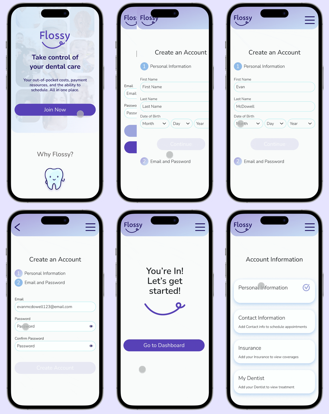
I chose to map out flows for Sign up and Schedule Appointment
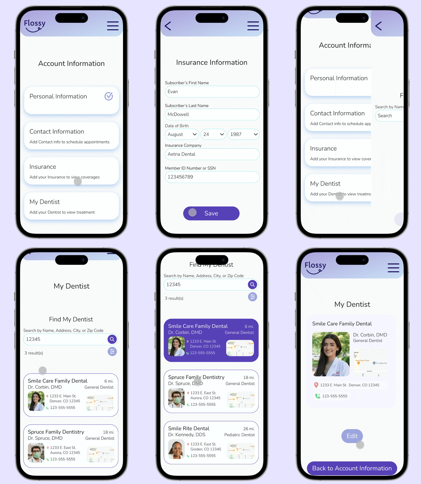
Users will be able to input their insurance information in the Sign Up flow and then that information will be used in the Schedule Appointment flow to show the user the cost breakdown for the chosen treatment

I created task flows for Sign Up, Schedule Appointment, and Edit Insurance information.
This is in consideration that a user may need to update their insurance information so that the system will be able to give accurate and up to date cost breakdowns

Develop
Bringing the design to life
Designing for strategic financial planning
With all of that information mapped out, I created low and mid fidelity wireframes to begin positioning all of the content.

I created screens that easily flowed through to the next. Highlighting the process of viewing treatment information and costs, planning for payment, and scheduling the appointment

Brand Identity
Emulating a sense of reliability and trust
In order to get users to trust the brand, I leaned towards a more friendly, fun and welcoming feel that also came off as credible, honest, and reliable.

Logo and iconography
This is where I finally landed on the name Flossy. I felt that going with a fun name gave the platform a sense of character and just as floss is used to get in between the teeth for a more detailed clean, this platform also aims to get into the details of costs of care. I played off of images of floss to land on the chosen logo.
.png)
Sticking to the theme of soft curves and simple shapes, I created icons for home, calendar, insurance, and account balance. I wanted to keep the icons simple so that they are identifiable even at a small scale. You can see my process of simplifying the icons in my original sketches.
Color palette and typography
For the color palette, I went with shades of blue and purple were chosen to exude calmness, reliability, and honesty. I chose a sans serif font called Nunito was chosen for its soft curves and non-authoritative feel

Assess and Refocus
I reached a point where I needed to take a step back and review my work so far. It became clear that my design was beginning to drift away from the intended goal.

Reevaluating the current design
After receiving feedback from my mentor, it was clear that the design was drifting more towards an appointment scheduling service with sprinkles of treatment cost information and resources. My aim is to design a platform that provides transparency in a patient's treatment and costs so that they can make informed decisions in preparation of receiving and paying for care. Once that is accomplished, patients would have the option to schedule their appointments.
It was necessary that I take a step back to realign with the goal
Making adjustments
I revisited the original site map and adjusted it to bring My Treatment in focus as a primary flow
First iteration

Second iteration

The Schedule Appointment flow became a Treatment Cost Planner flow
First iteration

Second iteration

Sketching additional screens
Once I realigned with the goal, I sketched new screens to adjust for the treatment cost flow

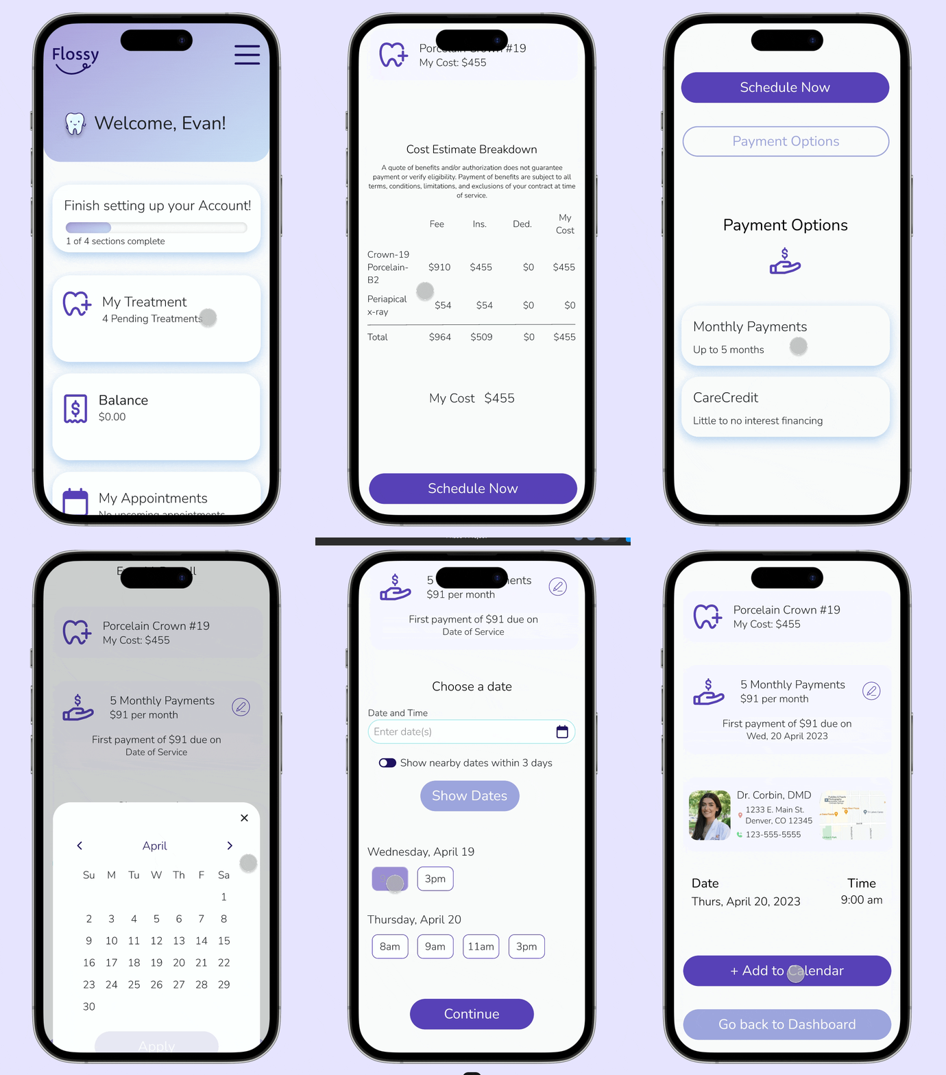
Users will start on the My Treatment page, view their costs, choose a payment option, then move on to scheduling

Develop
Back on track, let's design
Bringing it all together
Now that things were straightened out, I moved right into high fidelity wireframing.

Considering the user thought process to design the experience
My focus was to keep the flow streamlined and simple. Users were guided through the process of planning their treatment costs in a way that their questions were already being answered.


Deliver
Validating and finalizing the design
Let's put this design in front of actual dental patients
Usability Test
I conducted a moderated usability test via Google Meet and recruited 5 participants between 20-40 years old who are receiving dental care, have paid out of pocket for treatments, and have scheduled dental or medical appointments both online and over the phone.
My focus was to determine the ease of use and effectiveness of the design and to discover and address issues that could prevent users from achieving their goals efficiently.
Task
-
Create an account
-
Find information about a treatment recommendation
-
Find financial resources for that treatment
-
Schedule the appointment

Success metrics
-
Ability to complete the task without hints
-
Participant rating of ease of use, task meeting expectations, visual design, and needs met on a scale of 1 to 5

Their main comments and feedback was laid out into a frequency to severity grid to determine priority revisions

Six priority revisions based off of the usability test findings
Optimize search button and instant search results in Find My Dentist
3 of 5 participants got stuck at this section needed a hint to move on. They mentioned that the search icon did not read as a button. Incorporating instant search results as it’s typed will also improve this section
Test colorblind accessibility of secondary buttons and adjust if needed
Option to Add to Phone Calendar
All participants suggested including an option to add appointment to their phone calendar
Search feature in My Treatment
In consideration of users with multiple treatments
Include Payment Plan due date when schedule appointments
If user has chosen a payment plan, include a reminder of the first payment due date
Add more Doctor information
Details about doctor specialty and contact information
Making priority revisions
Adjusted primary and secondary button colors for colorblind accessibility

More prominent search button for increased affordance for search feature

Added more details for dental providers

Added search feature in My Treatment

Included more detailed payment breakdown

Added action to add appointment to phone calendar

Other revisions
I was getting closer to a finalized design, so I continued to make iterations to improve the brand identity
-
Updated hero section to include photos of happy, satisfied users
-
Fun Flossy graphics throughout the site to bring in more character
-
Brought cohesion to the color palette by incorporating a purple gradient

Future roadmap
I was challenged to understand the user thought process
By truly understanding their needs, motivation, and pain points, I was able to base every design decision in a way that put the user first. This is what made the design truly impactful. My biggest takeaway from this project was the power of iteration. By being open to feedback, I was able to hone in on the project goal and create a design where the users felt heard.
Of course, there is always room for improvement and other areas to continue to consider:
-
Add dependents to account to allow cost planning for entire household
-
Ability to add other providers such as specialty dentists
-
Educational resources about their treatment plus pros and cons
-
Ability to view and track insurance claims
-
Provide open lines of communication between users and their dentists
-
Add options for customizable cards on dashboard


